
Option #1. This is my favorite. It's simple and pretty, but still kind of casual--which is exactly what I'm going for:

Option #2. I like this one a lot, too. Those pictures are just placeholders for now, and I'd put real images in there if I go this direction:
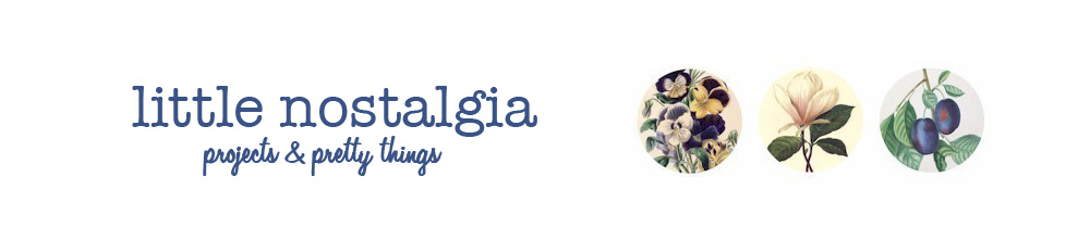
Option #3. And here's the original design I tried, just with the tag-line added. After making the other two, this one feels a tad on the fancy side, but that could just be my early-morning brain speaking for me:

I think I'll pick a banner today and then start implementing everything tomorrow. Just a heads up: the banner and URL will be the first things to change, so if you have me on a bookmark list, that can be switched to littlenostalgia.blogspot.com anytime tomorrow.
Let me know your thoughts on the banner (or anything else, really, I like to chat), and be sure you stop by to see the new look!
I love the second one. The three little circular pictures are super cute. I'd say a toss up between one or two...either would be great!
ReplyDeleteI like #1!
ReplyDeleteI vote for #3!
ReplyDeleteI think my vote is for number one, although I do like the typeface on number 2. And I love the tagline. I think that sums it up pretty well and definitely lets people know what they're in for. Yea, I think number 1. :)
ReplyDeleteMy vote is #3! I think it's gorgeous!
ReplyDeleteI like #3. The typeface is nostalgic and pretty at the same time. You could always use this typeface with the pictures from #2. I think that would look great!
ReplyDeleteMy vote is for #3 also (although - the first one is very close in second place)
ReplyDeleteAngie (blogging buddies)
Number 1! Number 1! I like the mix of Helvetica and the floral print.
ReplyDeleteP.S. I like your tagline; I think it helps with the name concern I had.
ReplyDeleteWow, they are all gorgeous! I's probably rank them in the order you have them listed .. the first is my favorite, then the second, then the third, haha! :) But they are all beautiful, nice job!
ReplyDeleteMy vote is for #3. I think it best represents the idea behind the blog and fits better with your jewelry style and overall aesthetic. I like the design of #1, but I don't think it meshes as well with your style.
ReplyDeleteI definitely like the top one the best. So cool Paige! I'm excited for you :)
ReplyDeleteI agree with Lori1585, the typeface of No. 3 with the three little pictures from No. 2 would be perfect. There's something about the typeface of No. 1 that I don't like. Maybe it's the bland colors....
ReplyDelete~Sooz~
I like #1 the most
ReplyDelete#1 or #2! so cute :)
ReplyDeleteI like 1 or 2 best. :)
ReplyDeleteThanks for all the input! I'm actually keeping a little tally on my desk.
ReplyDeleteThey are all great, but my vote is for #3! Nice work!
ReplyDeleteLOVE the new look! I'm definitely like the first option best and now that I see it on the blog, I'm digging it! :)
ReplyDelete